The problem
Users found carbon offsetting complicated and were skeptical of it. They didn’t know where their money was going or how to track their climate impact.
The goal
The goal was a mobile app that guides people through offsetting their emissions, shows where the money goes and tracks their impact over time.
Research summary
We started with the assumption that users found carbon offsetting confusing, untrustworthy and hard to fit into their daily habits. User interviews and secondary research confirmed that most users were unsure how offsets worked, wanted transparency and valued simplicity above all. That shifted us from a feature-heavy approach to a focused, guided experience that asks users to make as few decisions as possible.
Pain points
Lack of trust in carbon offset programs
Many users were skeptical about where their money went and whether offsets made a difference. We made the use of funds transparent, with clear language and visual breakdowns.
Too much technical language
Offsetting platforms often used jargon that put users off. We rewrote the copy in plain, friendly language and avoided industry terms.
Overwhelming options and decision fatigue
Users didn’t want to choose between dozens of offset projects. We offered curated plans based on impact goals, and users can dig deeper if they want to.
No clear way to track progress or stay engaged
Users felt disconnected from their ongoing contribution and needed a reason to keep going. We added monthly goals and progress streaks so users can set targets and feel rewarded for acting consistently.
Persona
Maya
29 · Marketing specialist · Toronto, ON
“I want to make a difference, but I don’t have time to figure out which offset programs are legit.”
About
Maya is a busy professional who cares about the environment. She needs a simple, transparent way to offset her carbon footprint because most existing platforms are confusing and hard to trust.
Story
Maya makes intentional environmental choices in her everyday life. She has a degree in Communications and works in marketing. She knows about carbon offsetting but finds most platforms too technical or unclear. She wants a trustworthy way to reduce her impact that fits her lifestyle without extra research.
Frustrations
- Most offsetting platforms feel technical and hard to understand.
- It’s unclear where her money goes.
- She doesn’t feel connected to the impact of her actions.
Goals
Offset her carbon footprint in a way she trusts, without hours of research or complicated options to manage.
Journey map
The journey map follows Maya, our primary persona, from first learning about carbon offsetting to becoming an active, long-term contributor. It shows where she might feel uncertain, disengaged or supported along the way. Each of its five stages exposed pain points and opportunities that shaped our decisions on clarity, progress tracking and content simplicity.
Digital wireframes
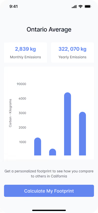
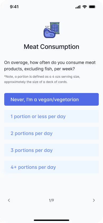
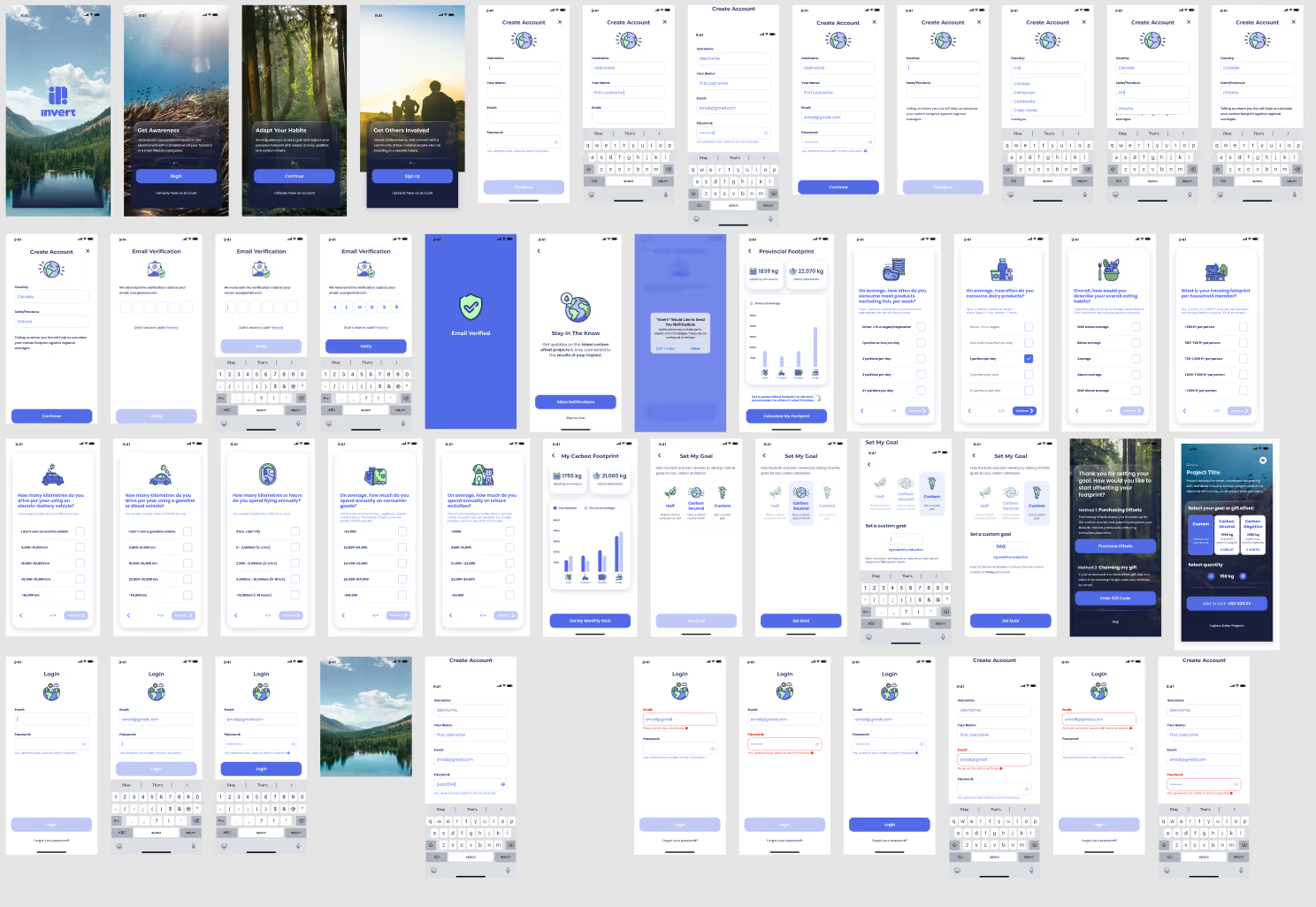
I built a clear visual hierarchy from consistent spacing, type and component sizes across screens. Each screen limits the options on it and keeps its buttons clear, which reduces cognitive load. Every element follows the research, which called for a simplified experience, minimal jargon and a guided path forward.
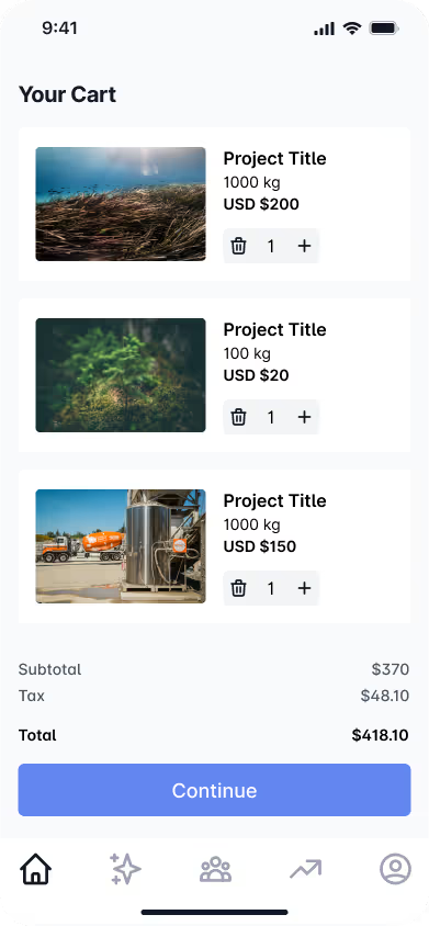
The checkout screen answers the concern about transparency. Each project shows the carbon it offsets, what it costs and a photo that adds a human or environmental connection to the project. Users can raise or lower the amount, or remove a project, without leaving the page. That lets them contribute at a level they’re comfortable with and cuts decision fatigue. The “Continue” button stands out enough to move users through checkout without being pushy.
Design system
I built a small design system so every screen shared the same colours, type, spacing and controls. Keeping the components consistent made the app easier to learn and the handoff simpler.


Prototype
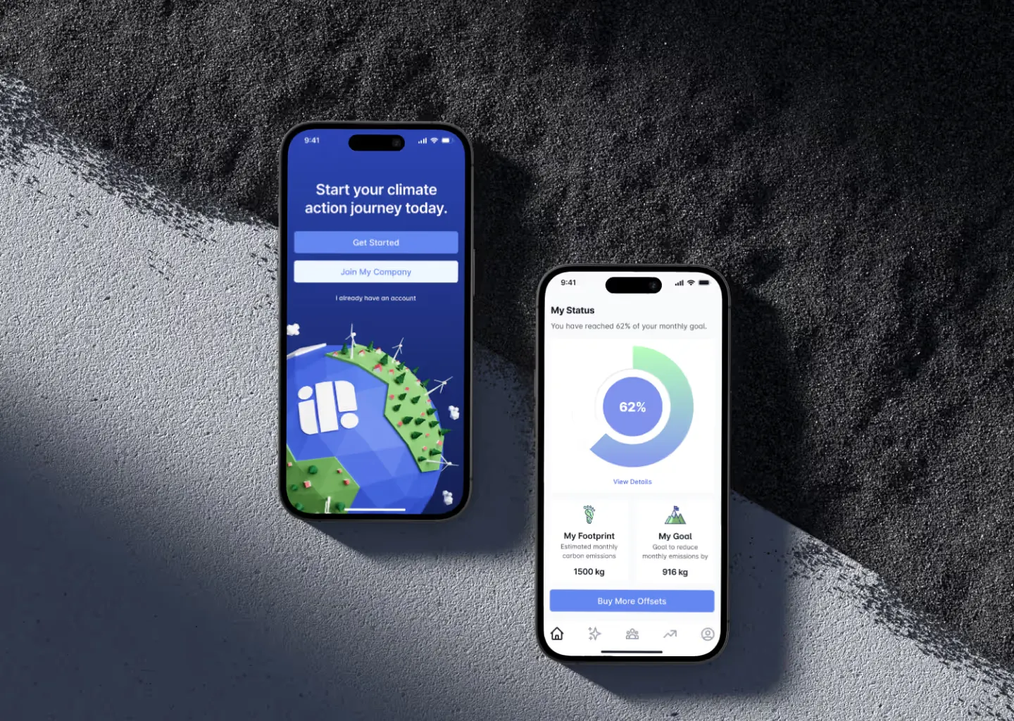
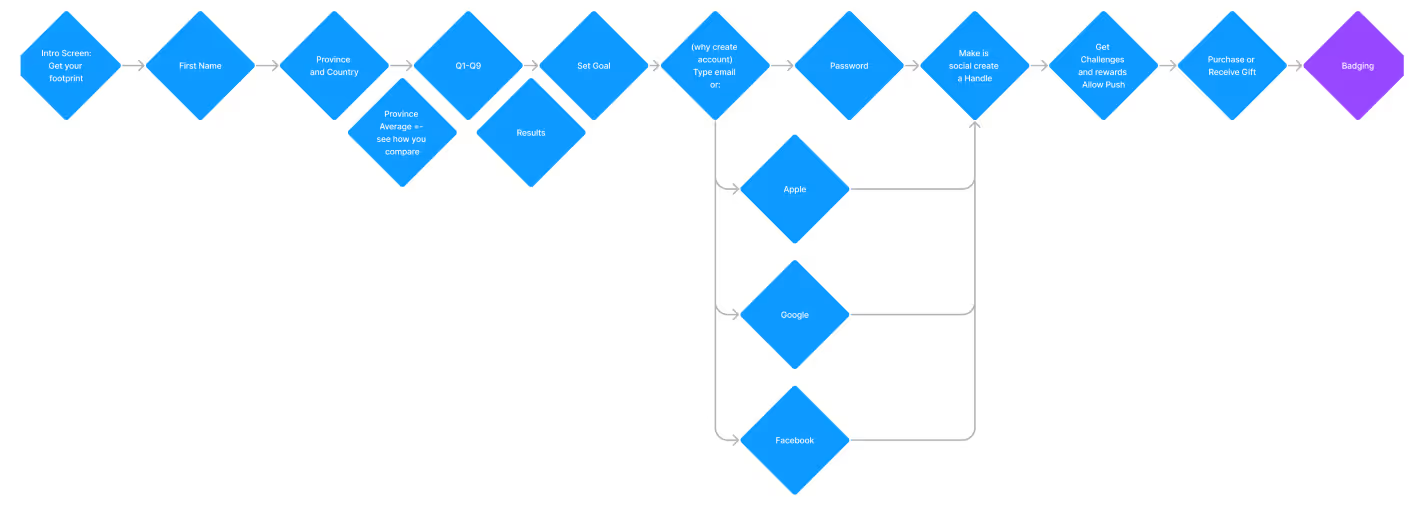
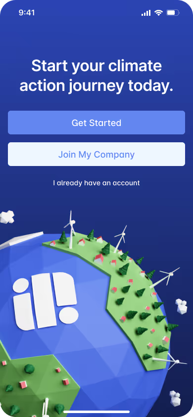
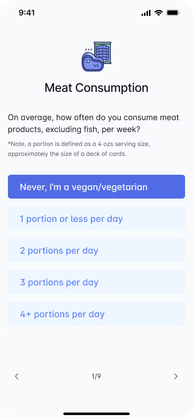
The prototype covered the complete flow, from onboarding to goal tracking and offset purchases. We used it to test how clear the navigation and screen hierarchy were and how easily users completed key tasks. Early feedback led us to refine the content and simplify decision points, which made the experience feel more guided and trustworthy.
Findings
We ran informal tests with peers and potential users to check clarity, usability and confidence across the app. The feedback focused on how intuitive onboarding, goal setting and tracking felt.
Round 1 findings
- Users liked the clean layout but wanted more context on what a carbon offset does.
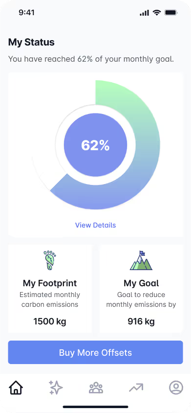
- Some users overlooked the “View Details” button under the progress ring.
- A few users hesitated at checkout because they weren’t sure their purchase had an impact.
Round 2 findings
- Updated copy improved clarity and increased user confidence during sign-up.
- Adding visual indicators to progress tracking helped with motivation.
- Simplified language around carbon project descriptions reduced hesitation at checkout.
Screens
Onboarding