The problem
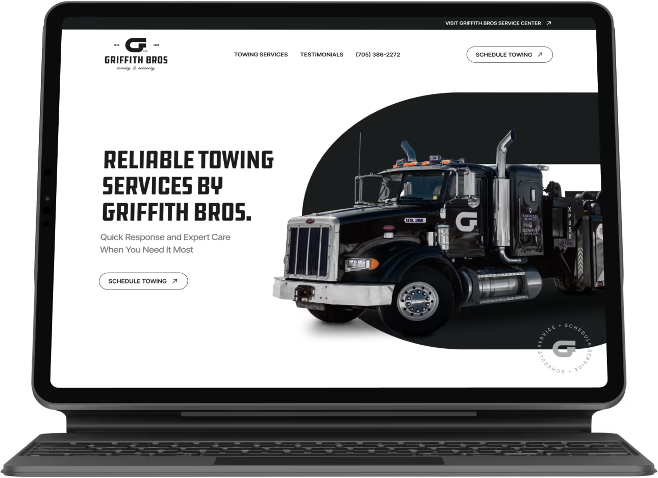
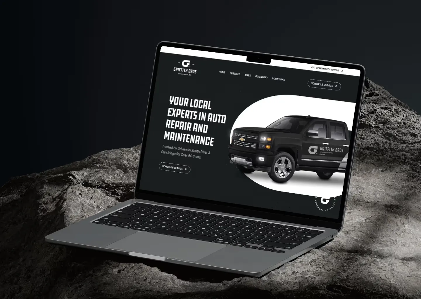
Griffith Bros. was running a tire e-commerce template. The shop’s main business is auto repair, and the site made that hard to see. Customers struggled to find its services and contact details, and the template didn’t look like a family-owned shop with decades in the community.
The goal
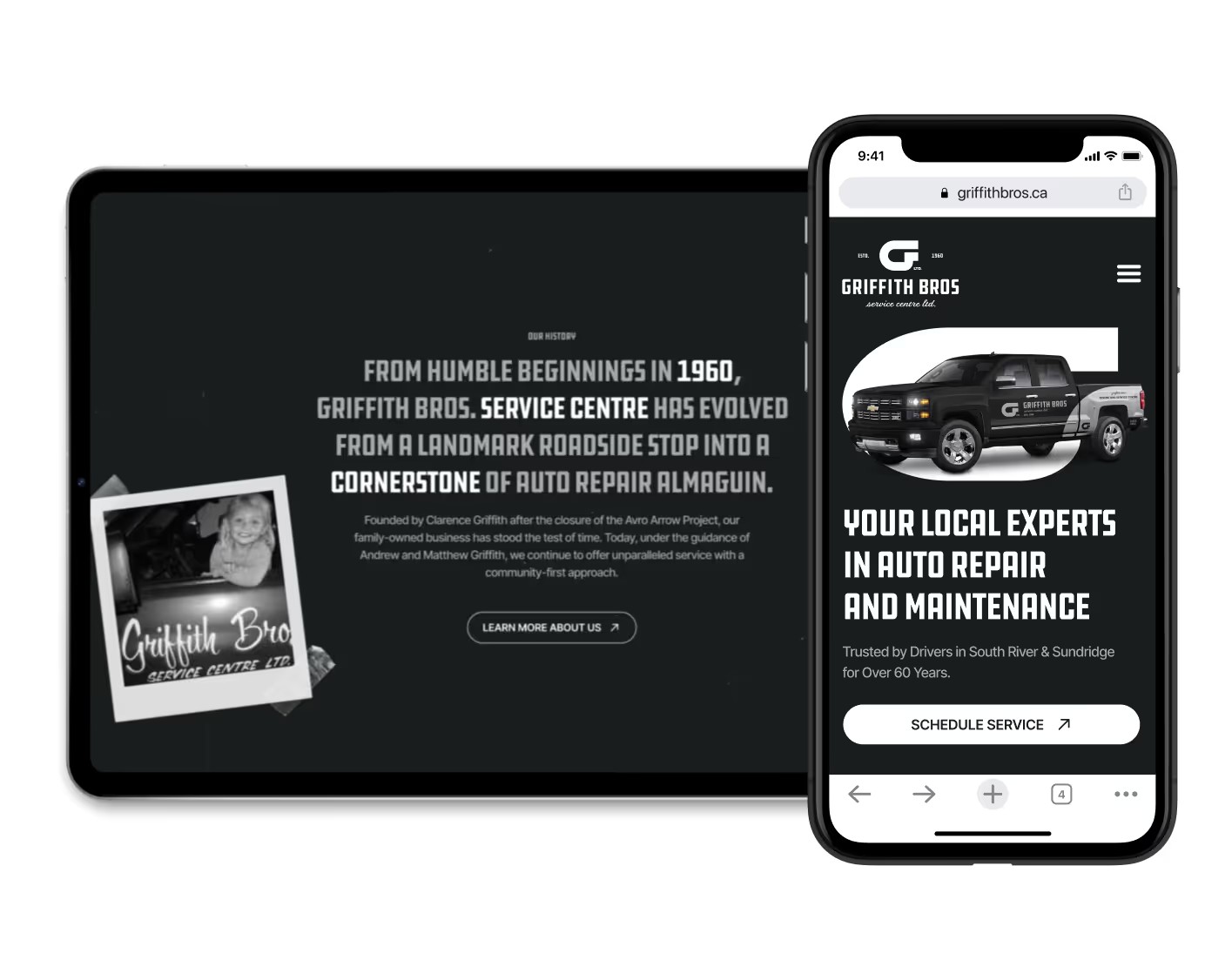
The shop had new branding from a graphic design team. The new site needed to apply that branding and show the family history behind it, so a first-time customer would trust the shop immediately.
Research summary
Research was informal. I talked with the Griffith Bros. team and worked from what they knew about their customers. Most are local residents looking for a reliable repair shop, and many visit the site on their phones. They needed to find services and contact details quickly and to get a trustworthy first impression.
Pain points
Content built around tires
The old site focused on tire sales, but the shop’s main business is auto repair.
Hard-to-find information
Visitors had to dig for service details and contact information.
Outdated visual design
The template didn’t reflect the brand’s family history or professionalism.
Not built for mobile
The layout didn’t work well on phones, where many customers visit the site.
Persona
Mike Thompson
45 · Construction worker · South River, Ontario
“I just want to find a local shop I can trust without having to dig around for basic info.”
About
Mike wants a local auto shop he can trust. The old Griffith Bros. site made it hard to find service information, contact details or any sense of the shop’s reputation, so he felt unsure about choosing them to look after his truck.
Story
Mike has lived in the South River area his whole life. He’s familiar with local businesses and prefers to support family-owned shops whenever possible. He drives an older pickup truck that needs regular maintenance to stay reliable for his work.
Frustrations
- Websites that don’t clearly list the services offered.
- Hard-to-find contact information like phone number and address.
- Outdated designs that make the business seem unprofessional.
- Wasting time trying to figure out if a business is the right fit.
Goals
Find a trustworthy, local auto service centre with clear information about services, pricing, and how to get in touch.
Journey map
The journey map follows a first-time customer from finding the shop online to coming back. At each stage it records what the customer does, thinks and feels, and where the site can help. The site was designed to support every stage of that journey.
Digital wireframes
The homepage wireframe opens with a hero and quick actions for booking or learning more. The company’s story comes next, to build trust early, followed by a simple service overview. Text is kept minimal and backed by visuals, so the page is easy to scan, especially on a phone.
Design system
A small set of colours, type styles, buttons and spacing rules kept the site consistent and easy to extend.


Prototype
Findings
Testing was internal, with colleagues at Grant Burke Design, and ran in two rounds. The first looked for where the old site fell short, and the second checked whether the new design fixed it.
Round 1 findings
- Testers couldn’t tell from the old site which services Griffith Bros. offered.
- The tire e-commerce layout left testers unsure whether the shop did repairs.
- Testers expected to see services, contact information and business hours as soon as the homepage loaded.
- Testers on mobile found the layout cluttered and hard to navigate.
Round 2 findings
- With the new structure, testers quickly identified Griffith Bros. as a local service centre.
- The focus on family history and clear service categories improved trust and engagement.
- Testers appreciated the simple layout and easy-to-find contact options.
- Mobile navigation felt smoother once the content blocks and flow were simplified.
Screens